Contents
- Index
- Previous
- Next
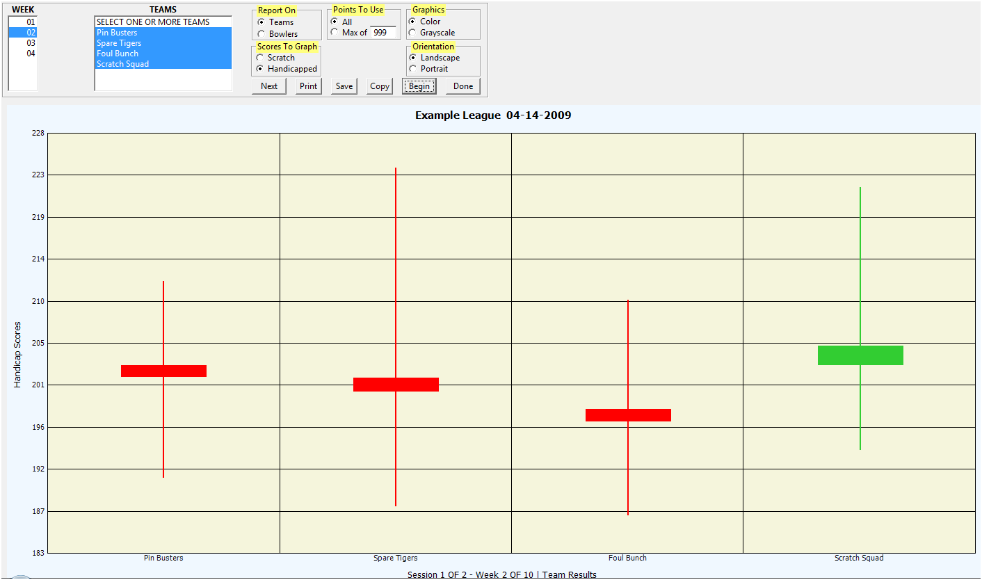
Graph Menu - Weekly Team or Individual Results
If you want a graph that illustrates how each team player did for any week, this is the graph to create. A different graph will be made for each week selected. To create these graphs you will need to specify:
Report On: Select Teams or Players (Bowlers in Bowling)
Scores to Graph: Select scratch or handicap scores.
The other controls on this screen are described on the help page for the Statistical Rankings graph. You can select one or more weeks, teams or players. The name of each team or player will be at the bottom of the graph. For each team or player there will be a bar on the graph. The top of the bar is the player's high score for that week. The bottom of the bar is the low score and the middle of the bar has a box. The box shows the current average and the entering average (top or bottom). If the box and line are red, there has been a drop in the average. If the box and line are green, there has been an increase in the average. If you use your mouse to hover the cursor over a box on the graph, the values for that box will be displayed.
If you have a large league, you may find that the number of bars on the graph is excessive and the graph cannot be easily read. The graph will normally be created using all the data. However, if you want to limit the number of data points per graph, click on the "Max Of" option and fill in the text box on the form to indicate the number of points to use for each graph. Separate graphs will be created for each set of points until all the data has been graphed.
Click on the image below for information about the reports.